Spain!
Thanks to the noble efforts of our catsitter friends, the famous librarian-and-animal scientist couple Clay and Mike, our tickets to Spain arrived safely, and we spent six public transportation-filled hours in Madrid while we waited for our train to the north.
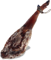
This might come as a surprise to some of you, but Madrid? Not a town for vegetarians. Within two blocks, we passed El Museo de Jamon, and Palacio de Jamon. Yes, that’s the Museum of Ham, and Ham Castle. Madrid was beautiful and huge and weird. We did a quick tour through la Plaza del Sol while searching for food. As the default sometimes meat-eater, I ended up consuming all things mysterious that arrived at our table. Which pretty much ended up being everything. We kept ordering things that seemed vegetarian, and they kept arriving covered in ham. Chris ended up eating a bocadillo and some cheese we brought from the UK.
The best library-related thing about Madrid was the Amazingly Clever and Fabulous Biblioteca Metro – sort of a bookmobile kiosk in one of the subway stations. It was charming, modern, well-designed, and the librarian helped us figure out the difference between commuter trains and metro trains. Sadly, we didn’t get a photo of it (or one of Ham Castle) because travel rule number one is: Sleepy people shouldn’t bring expensive digital cameras that they don’t own into downtown Madrid on a Friday night. So you’ll just have to imagine it. Mmm.
We couldn’t get a sleeping car to our conference in Gijon because they were all going to Bilbao, so we ended up sleeping in the brightly-lit second class compartment with our feet on our bags and cricks in our necks. Our guidebook, which shall heretofore be referred to as The Big Book of Paranoia, convinced us that every third person was a pickpocket, so that didn’t help with the sleeping. This morning was a blur, spent trying to speak enough Spanish on .2 hours sleep to convince the kind hotel lady to give us una cama de no fumando. We have now learned that the process of preparing a no smoking room in Spain involves removing the ashtray and spraying Drakkar everywhere.
Still, this may be the best hotel I’ve ever stayed in. I want the hotel decorator to come and visit my house immediately. Everything is modern and minimalist and ergonomic and just so not British. It’s Hotel AC Gijon. It’s a chain. I unhesitatingly recommend it, and not just because they gave us our rooms at 7am on a Saturday, when every sensible Spaniard is home with a hangover.
We to took a long hike around the city center this afternoon and walked along the sea, then returned to the hotel exhausted. Chris took gobs of photos of la Biblioteca Gijon for your viewing enjoyment. They have a cute and comfy reading room filled with middle aged men reading the newspaper.
We watched Pedro Almodovar’s Carne Tremula tonight on one of our laptops and now appreciate Madrid even more. I think this is one of Almodovar’s most accessible and least creepy films. If you want to check out a great piece of Spanish cinema but don’t want to yell “Oh God please don’t do what I think you are going to do” every five minutes, then this is the film for you.
Hi to everyone. I just read my London comments today and am Really grumpy to have missed the Women’s Library. But we also missed Westminster and The tower, thanks to some bad info about closing times. I also planned to become a reader at the British library, but we didn’t have time to return. So, feh. We’ll be back. And next time I’m bringing my 12 postgraduate degrees so I can stay.
 Hi all – a quick update. I don´t want to type much since I´m using a cybercafe machine and the keyboard is greasy, perhaps due to the monumental consumption of pork products in this country. Great XForms tutorial this morning at the conference. I learned a whole lot about XHTML 2.0 as well. This is some damned exciting stuff for libraries and the library-ness of the web. I´ll try to talk some more about XHTML2 when I´m not dizzy from Spanish over-the-counter cold medicine.


 The conference is in a combination of English and Spanish, with simultaneous translation headsets, so there’s a strange aural halo of chatter going on in the background. I’m providing my own simultaneous translation by blowing my nose every five minutes or so. Stupid cold.