 Thanks for all of the kind comments on the previous post. They really helped balance the freaking out I had to do when a kind well-meaning soul posted this link as an example of a REALLY GOOD children’s website.
Ok. Let’s go through this again. Slowly. This time I’m going to spell it out.
Anyone can make a website. The web is the most democratic publishing forum ever conceived. But, unfortunately, just because you can do something doesn’t mean you are the best person to do it. It is an unpleasant fact that most library websites, most digital libraries, most catalogs and electronic collections are badly designed.
And by badly designed, I mean this. Ugly. Ill-conceived. Verbose. Inaccessible. Acronym rich. Confusing. Lofty. Unnecessarily complex. Deprecated. Self-absorbed. Low-quality. Pointless. Patronizing.
Are you still with me? Remember, I’m being a bitch so that you don’t have to.
There is a tendency in the library community to blow sunshine up each other’s asses, as though our intent to do good were enough. As though our good works shouldn’t be held to the same standards as commercial products because we are Nice. People don’t seem to criticize each other’s work in this profession. Which makes for a perfectly lovely working environment where you can find yourself producing piles of junk because all you have heard is happytalk from supportive colleagues. And that’s not Nice. Nope. Not at all. That’s painful and embarrassing and rather cruel.
You would tell a friend if she had toilet paper on her shoe, right? Gentle criticism (not my specialty, obviously) has a place in any relationship, especially when the stakes are high. When your TP-shoed friend is about to go up on stage in front of a bunch of elementary school kids, they probably aren’t going to listen to her charming and educational speech. They are going to see the toilet paper and turn into a pack of hyenas.
And it’s a shame, because the Internet Children’s Digital Library (and the gajillion sites like it with smaller budgets) have the potential to become popular resources if they will only make the connection between quality of content and quality of interface. Like so many digital collections, they have great ideas, like sorting books by color, but they don’t have the skill or the perspective to realize these ideas. And they don’t have the humility to hire someone who does. So up they go in front of the auditorium with a big wad of TP dragging behind them.
 To that end, I invented a new thing that I’m going to act like I’ve been doing for ages: The Librarian Avengers Stomp of Approval.
 .
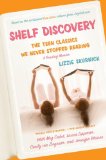
 If I suffered from Pageant-Mom syndrome and wanted to create an exact replica of myself from the raw material of some random pre-teen girl, I would begin my narcissistic experiment in literary manipulation by having her read all of the books celebrated in Shelf Discovery.

 Thanks for all of the kind comments on the previous post. They really helped balance the freaking out I had to do when a kind well-meaning soul posted this link as an example of a REALLY GOOD children’s website.