

You can now mock the poor fools who slept through 8th grade punctuation day by contributing to the “Blog†of “Unnecessary†Quotation Marks.
Quotation marks for emphasis? Fie!
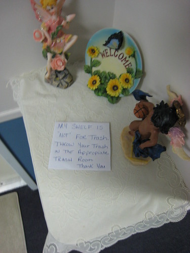
While you are out, visit the Passive Aggressive Notes blog and enjoy the work of some self-appointed Social Contract enforcers.
Just a suggestion.
Also? Can you “please” do the dishes?
Thanks.
-Librarian Avenger
So funny, really. Just remember, while using inappropriate quotation marks, be sure to put the comma or period inside the quote mark.
LOL, next time I have a camera with me I’ll take a picture of the sign in my apartment building that mysteriously appeared a few months ago and has been bugging me ever since. Little background info: the building is a converted townhouse, walk up, common stair (think Breakfast at Tiffany’s). It’s in a historic part of town so they can’t put in one of the fancy type doors that lock automatically or anything so it’s just a door with a deadbolt.
Anyway, we are now asked to “lock” the door (coming and going) after 6pm to maximize the safety and security of the building. The lock sticks and is a royal PITA to lock on your way out–it’s a complicated procedure these days. I’m always tempted to just pretend I’ve locked the door rather than struggle with it, especially if I’m just going out on an errand. They did say “lock”, after all.
Thank you, thank you. I really needed that. I forwarded to a few friends and laughed until I cried.
Ah, I do love the inappropriate emphasis quote.
When I was still working in the distro center for the Giant Corporate Overlord (a bookseller that rhymes with Sarnes and Mobile), sometime around the end of the year the receiving people dropped off a large, semi-crushed, but otherwise nondescript corrugated cardboard box in our office. As I was running the floor that day, I went over to see what it was. Inside the box were about 30 sweatshirts, in the most putrid brown you could imagine on clothing. (Ever see a barista wipe up the spillage around an espresso pump? You know the color brown the rag becomes? Worse than that.) All of the sweatshirts were size medium (and if you know me, you know I haven’t worn an adult medium since the Reagan administration), and had a small corporate logo in what can only be described as ‘puke beige’ on the front.
Got all that?
Stapled to the tag of each size medium, horrid brown shirt (with puke beige logo) was an index card, with this notation:
HERE IS YOUR EMPLOYEE APPRECIATION “SHIRT”.
As though the shirt wasn’t horrible in and of itself, the card almost made it seem as though we weren’t being given a shirt at all, merely the IDEA of a shirt.
In retrospect, tho, I’m sure the HR drone who created that card meant to emphasis-quote ‘Employee Appreciation’, and not ‘Shirt’.