 I got this in my email today:
What children can teach us: Lessons learned from the trenches of digital libraries“…developing digital libraries that support young people in querying, browsing, and reading scanned materials.”
It all sounds very impressive until you click the link. Look at that thing! It’s like getting stabbed in the eyeballs with suck! How can these people sleep at night?
This is a perfectly good children’s resource that is absolutely hidden from children. What is the focal point of the page? The word “Advanced” forgodsake. Why are there four search options? Do they actually think children care enough to distinguish between different search criteria? Who are these children? Can I have one?
I can’t even begin to list the mistakes they are making in this interface. Where is the content? I see three books. Why is there so much text? I don’t want to read that badly-formatted crap, and I’m a grown-up. Why is 98% of the navigation dedicated to links that are of absolutely no interest to children? Executive Summary? Yeah, my kid’s gonna click on that one. Why didn’t they hire a professional web designer? They make a huge deal about how kids “designed” the site, but they didn’t bother to honor those kids’ contributions by hiring a decent web developer. They’ve got more than 5 million dollars, they can afford it. In the time it took to write their complete curatorial policy (conveniently linked on the FRONT PAGE) they could have at least changed the default link color.
Once you actually find the content (just click “Simple Search” and chase the badly-written JavaScript pop-up around the screen until it works! It’s obvious! Cyborg children love to search!) the interface settles down a bit. The links related to the grant go away, and the library experiments with some innovative ways to find books, by color, length, etc. Good stuff. Except except except the graphics are so shitty and the labels are so poorly thought-out (“Real Animal Characters” rather than “Animals”, “Imaginary Animal Characters” rather than “Pretend Animals”) that it just all falls apart.
This site was designed for librarians, not for children.
 Humor me and compare it to nick.com (a favorite among the kids we researched in grad school). The big difference between the two is, on this site you can click absolutely anywhere and find something satisfying. You don’t even need to click. Information is conveyed by rollover sounds and animations. I’ve personally witnessed kids fight with each other over headphones in order to hear these sounds.
Look, I know I’m being an ass, and this is a great resource and these are good people and I’m going to get hate mail, but somebody has to say it.
It’s not enough that we are lovely librarians who care sooooo much about children. It’s not enough that we put all of this great content up on the interweb. It’s not enough that we are overworked researchers who will have to write tedious papers about the project to justify our tenure.
We need to run everything we do through a filter that asks: “If I click on this without a Master’s degree in Library Science, will it piss me off?” We need to acknowledge that design matters. We need to remove ourselves from our collections. We need to design websites that don’t mock the resources they contain. We need to do these things because otherwise all of our efforts are worthless. We need to design websites that don’t suck, because otherwise the kids that we care so much about are going to wander off and smoke crack. And it’s going to be our fault.
 Anyone who lives in New York state is eligible for a card, so I now have access to the library’s impressive collection of online resources.
 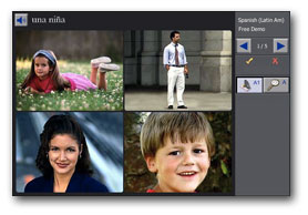 The lessons are reinforced with audio, video, writing and images, so it imitates an immersion experience more than a typical grammar-based language course. There’s even a module that has you speak into a microphone and shows you a waveform comparing your speech with someone who doesn’t suck.
 Thanks for all of the kind comments on the previous post. They really helped balance the freaking out I had to do when a kind well-meaning soul posted this link as an example of a REALLY GOOD children’s website.